

Quick answer: A plain coloured square with one strong sentence beat every carousel, video, designed layout and stock photo we tried. The words and the offer did the work, not the art. If you only change one thing about your next ad, change what it says, not how it looks.
We are PaperCutCollective, a Singapore digital marketing agency. From May to October 2026 we ran Meta lead ads for ourselves, changed one thing at a time against a control, and judged every version on link clicks. Over 11 rounds we built and killed 26 variations. This post is the creative scoreboard: what won, what lost, and the numbers behind each call. If you want the method itself, it is in our testing guide.
One thing to hold in your head before the list. Creative is the second lever, not the first. The offer, what the ad is actually about, moved our cost per lead further than any design choice we ever made. Everything in this post sits downstream of that. So treat the wins below as what to do once you already have a strong offer, not as a way to rescue a weak one. A beautiful ad for a boring offer is still a boring ad. The reason we can be so blunt about design is that we tested it the slow way, with a control running the whole time and only one thing changed against it, so every call here is a like-for-like result rather than a hunch.
The six things that won
1. The message
The biggest lever by far was what the ad was about. Moving from a generic “grow your business” idea to a grant message took the cost per lead from about $48 to $19 on a like-for-like test. No creative trick came close to that. Decide what your ad is really offering before you touch anything else.
2. The exact wording
Inside the winning message, the sentence still mattered. The version that framed the grant as something owners were missing, “most SME owners don’t realise the government will fund half their marketing”, beat plainer savings lines. Same offer, sharper words, cheaper lead.
3. The ask
What we asked people to do changed how many of them did it. Switching from a “free 30-minute strategy session” to a “free quote” lifted the share of link clicks that became leads from 11% to 17% at the same cost per click. A smaller, clearer ask converts better.
4. A plain single image
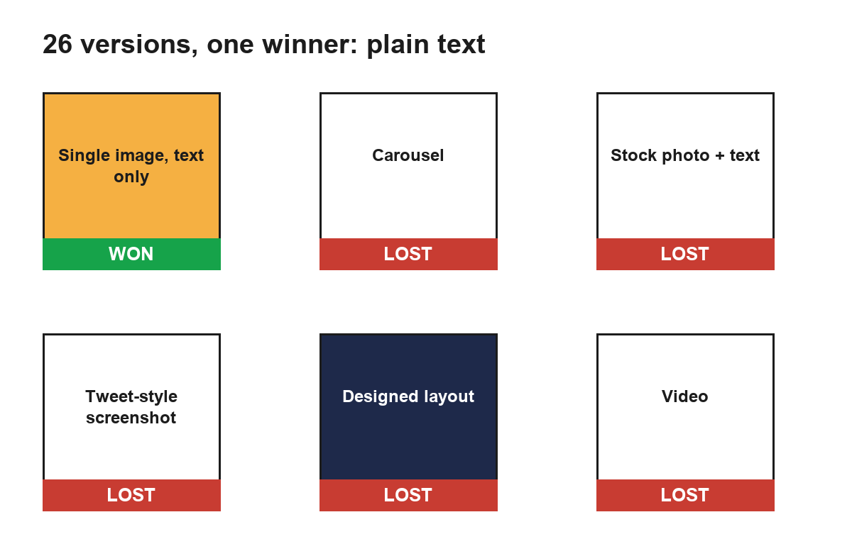
A plain amber square with black text beat designed layouts, a carousel and a video. The card did not try to be beautiful. It tried to be readable. When the offer is strong, a clean card gets out of the way and lets the words land.
5. A broad audience
Broad targeting of Singapore adults 25 to 54 held up against narrow industry audiences, and Advantage+ audience expansion held at about $14 a lead. We stopped slicing the audience thin and let the system find buyers. The creative, not the targeting, was doing the heavy lifting.
6. A longer caption
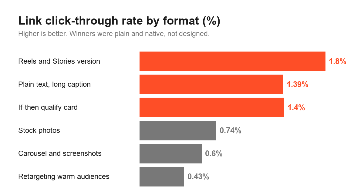
A three-sentence caption reached 1.39% link click-through against 1.03% for a one-line caption. People will read a little if the first line earns it. Give them a reason, a line of context and a clear next step, rather than a single slogan.
Notice the shape of that list. The first three wins are about words and the offer. The last three are about format and framing. Spend your effort in that order. We have watched owners agonise over the image for a week and write the sentence in five minutes, when the test says the sentence was always going to decide the result. If you are short on time, get the first three right and let the rest be plain.
The nine things that lost
1. Carousels
Every carousel we tried ran under 0.6% link click-through. Asking people to swipe before they act added friction a single card did not have. For a direct lead offer, the extra cards cost us clicks.
2. A tweet-style screenshot
A card dressed up as a screenshot of a tweet looked clever and performed under 0.6% link click-through. The format drew the eye but not the tap.
3. A chat-screenshot card
A fake chat screenshot lost in the same way, under 0.6% link click-through. These native-looking formats get attention in a feed, but attention is not the same as intent to click a link.
4. Video
Our video lost to the plain card. It took more effort to make and returned a worse cost per lead. For a direct offer, the plain square was both cheaper to produce and cheaper to convert.
5. Designed layouts
Polished, designed layouts lost to the plain coloured square. The design added nothing the sentence was not already doing, and sometimes it buried the sentence.
6. Stock photos
Four stock photos of “business owners” in one ad set cost about $61 a lead against about $14 for a plain text card, at 0.74% link click-through. Generic faces did not build trust. They just took up the space a clear line could have used.
7. An urgency card
A card built on urgency lost. It even looked like a winner on raw click-through at first, until we checked link clicks and found most taps were people opening the caption, not clicking through. Manufactured urgency did not move real leads.
8. A proof card
A card boasting about client numbers lost too. When the offer is a government grant, a “trusted by” badge is weaker proof than the grant itself. The card spent words on us instead of on the reader.
9. Retargeting warm audiences
Retargeting page and Instagram engagers was the worst arm in the whole project: 0.43% link click-through and $9.30 a link click. For a cold, broad offer like a free quote, chasing warm audiences burned money. See what that did to the account in the cost post.
There is a pattern in those nine losers worth saying out loud. Almost every one of them was an attempt to be clever: a format that mimicked something native, a stack of stock faces, a countdown, a badge. Clever gets noticed in a feed, and noticing is not the same as acting. The losers won attention and lost the tap, which is the most expensive place to win. The plain card did the opposite. It did not turn heads, but the people it reached were ready to click, and that is what a lead ad is paid to produce.
Why plain cards beat polished ones
It is worth saying why we think the plain card kept winning, because it will help you resist the pull toward fancier work. A feed is a wall of polished images. A plain coloured square with one black sentence does not look like an ad, so it reads as information rather than persuasion, and people trust information more. It also forces the sentence to do the work. When there is nowhere for a weak line to hide behind a photo or an animation, you find out fast whether the offer is any good. In our test, every time we added a layer of design, the cost per lead went up or stayed flat. Not once did polish pay for itself. That does not mean ugly wins. It means clear wins, and clear usually looks plain.
Colour: the most overrated variable
Everyone wants to talk about colour, so here is the truth from our test: it barely mattered. Amber, navy, white, red and black moved the cost by only a few dollars when we compared like for like. Red and black never beat navy. A white card was roughly equal to amber. The sentence on the card decided the result, and the colour it sat on was almost noise. If you are debating brand colours for your next ad, spend that time on the sentence instead. You will get far more back.
Headlines: give a reason to act
The headline, the short line under the image, worked best when it gave people a reason to act rather than restating the offer. “See if you qualify” beat “get up to 50% funded.” The first is a small, doable step. The second is just the offer again. One qualify-style card even reached about $13 a lead for a while before it faded, which tells you the headline can carry an ad on its own for a time. Write the headline as the next step, not as a second slogan.
Reels and Stories formats
We made a vertical 9:16 version of the winning card for Reels and Stories, and it got the highest link click-through of anything we ran, about 1.8%. But it converted fewer of those clicks into leads, so the cheaper click did not become a cheaper lead. The lesson is to use a native vertical version to win attention in Reels and Stories, while judging it on cost per lead, not on click-through. A format can win the tap and still lose the outcome.
What this means on a small budget
If you are testing on something like $20 a day per arm, the creative lessons above are good news, because the winners are all cheap to make. You do not need a videographer, a designer or a stock library. You need a strong sentence on a plain card, a three-sentence caption, a headline that offers a small next step, and the patience to let complete days play out before you judge. That is a brief you can write yourself in an afternoon. Make a control, make one variation that changes a single thing, give each about $20 a day, and read link clicks first and cost per lead once an arm has enough of them. Then keep the winner as the new control and change one more thing. The full version of that loop, including when to cut and how long to wait, is in our testing guide. The point for creative is simple: because plain beats fancy, the cheapest ad to produce is usually also the one most likely to win, which is a rare and welcome thing in advertising.
It also means you should not over-produce early. Spend your first weeks finding the sentence and the ask, not commissioning a video you will probably cut. Once you have a plain card that converts, then, and only then, is it worth making a vertical version for Reels and Stories to chase a little more reach. Doing it the other way round, polishing before you have proven the offer, is how most small budgets get spent with nothing to show for them.
A simple creative checklist for your next ad
Everything above, boiled down to ten things you can act on:
- Decide the offer first. It matters more than every design choice combined.
- Write one clear sentence. Make it specific and about the reader.
- Use a plain single image before you try anything fancier.
- Ask for one small thing, like a quote, not a big commitment.
- Write a three-sentence caption, not a one-liner, but earn the first line.
- Write a headline that gives a reason to act, not a restated offer.
- Keep the audience broad and let the system find buyers.
- Skip the stock photos. A clear line beats a generic face.
- Skip urgency and “trusted by” badges unless they are genuinely true and specific.
- Make a vertical version for Reels and Stories, and judge it on cost per lead.
None of this needs a studio. It needs a good offer, a clear sentence and the discipline to test one change at a time. If you want help putting it to work, this is exactly what we do with Meta ads for Singapore businesses, and much of it can sit inside an EDGE-supported plan. For the current grant terms, read the official Enterprise Singapore EDGE page.
One honest caveat before you copy any of this
A winning ad is the start line, not the finish. Better creative gave us cheaper clicks and cheaper leads, but a cheaper lead is not a customer. What turns a lead into a client happens after the click, in how fast you follow up and whether you get the person onto a call. We would rather you run a plain card and answer every enquiry within the hour than run a beautiful one and reply the next day. Use these lessons to lower the cost of getting attention, then put your real effort into what you do with it. The creative decides how many people raise their hand. You decide how many of them become clients.
Frequently asked questions
Single image or carousel for lead ads?
In our test a single plain image beat every carousel we tried. The carousels ran under 0.6% link click-through, which was not close. For a direct lead offer, one clear card with a strong sentence did better than asking people to swipe.
Do stock photos work in Facebook ads?
Not for us. A set of four stock photos of business owners cost about $61 a lead against about $14 for a plain text card, at a link click-through of 0.74%. The photos added nothing a clear sentence did not already do.
How long should a Facebook ad caption be?
Longer worked better in our account. A three-sentence caption reached 1.39% link click-through against 1.03% for a one-line caption. Give people a reason and a little context, as long as the first line still earns the tap.
Does ad colour matter?
Barely. Amber, navy, white, red and black moved our cost by only a few dollars like-for-like, and red and black never beat navy. The words on the card mattered far more than the colour behind them.
Should I use video for lead generation?
We would not start there. Our video lost to a plain coloured square with one strong sentence. Video can work for awareness, but for a direct lead offer the plain card was cheaper and simpler to test.
Want this applied to your ads? Get a free EDGE quote and we will scope your paid social, write the offer and tell you what support you may qualify for.